Gjensyn med Widerberg
Forlaget Press
2024
Info
Gjensyn med Widerberg
Frans Widerberg (1934–2017) is considered one of Norways foremost painters and graphic artists. This book offers three newly written attempts to understand the artist and esotericist who appealed so broadly and filled so much space in Norwegian art circles for several decades.
Year: 2024
Publisher: Forlaget Press
Format: 160 × 230 mm
Papers: Munken Print White 100 gsm, Geltex
Font: ABC Marist (ABC Dinamo)
Pages: 336
Language: Norwegian
‘My Châteaux’
MUNCH
2024
Info
‘My Châteaux’
Edvard Munch would often describe his home as his ‘castle’, or ‘château’. This pocket sized book is a travel guide giving a tour of Munch‘s many properties in Norway. It is published in three languages, typeset in Antique Legacy and Schnyder. The book cover is screen printed and bound with two different Geltex qualities placed horizontally.
Year: 2024
Head of publishing: Josephine Langbrekke
Editor: Nina Schjønsby
Publisher: MUNCH
Repro: JK Morris (Sweden)
Printer: Livonia Print (Latvia)
Format: 130 × 205 mm
Papers: Munken Print White 80 gsm, Geltex 115 gsm
Fonts: Antique Legacy, Schnyder
Pages: 128
Languages: Norwegian, English, German
Fridtjov, Torstein & Edda
Skald
2023
Info
Fridtjov, Torstein & Edda
Fosse's sagas about Fridtjov the Bold and Torstein Vikingsson, and the Old Norse poems in Edda, are texts originally written in the 13h-14th centuries. Fosse has given the texts a modern form. The typography on the covers is inspired by the capital letters used in the original manuscript of Edda (Codex Regius) and was calligraphed by Stefan Ellmer. It was desirable to create contrasts between the historical and the modern to emphasise Fosse's approach to the project. To create a contrast to the medieval typography, Haas Grotesk was used. It was also used in the body text along with Tiempos Text. These are the 2nd editions of the books.
Year: 2023
Co-designer: Stefan Ellmer
Publisher: Skald
Editor: Simone Stibbe
Printer: Balto Print (Lithuania)
Format: 120 × 160 mm
Printing Techniques: Offset 1+1, Offset 4+4
Papers: Munken Print Cream 115 gsm, Geltex
Fonts: Calligraphy, Tiempos Text, Neue Haas Grotesk
Binding: Hardcover bound
Pages: 176
Language: Norwegian
Berlin
Forlaget Press
2023
Info
Berlin
This book is written as four historical walks through Berlin, all starting from Potzdamer Platz. The format is a standard novel size. The book is written as a pure non-fiction and simultaneously a kind of travel guide to Berlin. Therefore, simple maps of the four walks are included. The fonts used in the book, ABC Marist and ABC Whyte Inktrap, are both designed by the Berlin agency ABC Dinamo. The book is printed on 90 g Munken Lynx and bound with a coated cover that is also laminated with glossy PP foil. Sigurd Fandango has taken the photographs for the book.
Year: 2023
Author: Helge Jordheim
Publisher: Forlaget Press
Editor: Trygve Riiser Gundersen
Photographer: Sigurd Fandango
Printer: Print Best (Estonia)
Repro: Italgraf Media (Sweden)
Format: 145 × 220 mm
Printing Techniques: Offset 4+4, Foilblocking Black
Paper: Munken Lynx 90 gsm
Fonts: ABC Marist (ABC Dinamo), ABC Whyte Inktrap (ABC Dinamo)
Binding: Hardcover bound with glossy laminate
Pages: 576
Language: Norwegian
Award: The Most Beautiful Norwegian Books 2024 (Grafill)
Bibelen
Forlaget Press
2023
Info
Bibelen
This Bible is Kjell Arild Pollestad's translation and is based on Bible translations in 15 different languages, primarily Hebrew, Greek, and Norwegian. The typography was developed specifically for this Bible and was designed in collaboration with Stefan Ellmer at The Pyte Foundry. The font is drawn in three weights: regular, semibold, and display, where regular is primarily designed for use in 8 pt type. The prose text is set in two columns and the poetry in one. The book is printed on 32 gsm Primabible at Royal Joengbloed in the Netherlands. The book is bound with Paradise book cloth from Manifattura del Seveso in the four liturgical colors: green, purple, white, and red. The typography foil blocked on the cover is the first verse lines from Genesis.
Year: 2023
Printer: Royal Jongbloed (The Netherlands)
Publisher: Forlaget Press
Author: Kjell Arild Pollestad
Type designer: Stefan Ellmer
Format: 155 × 220 mm
Papers: Primabible 32 gsm, Colorplan
Binding: Hardcover bound, Belly band
Font: Bibeltype
Cloth: Paradise
Printing Technique: Foilblocking Gold
Pages: 1440
Language: Norwegian
Award: The Most Beautiful Norwegian Books 2024 (Grafill)
Arven etter Aldus
Forlaget Press
2022
Info
Arven etter Aldus
This is Øyvin Rannem's second book on typography. While the first book dealt with the development of our modern letters from Roman majuscules, this book focuses on the serif typeface and its development after Aldus Manutius, a 15th century printer in Venice. The typeface Bembo is used throughout, a typeface that was designed by Francesco Griffo for Aldus around 1495. Similar to Rannems previous book, Bokstavene i historien (Letters in history), the image material was of varied character and quality. To maintain consistency, all images are presented in black and white. In the book, text and images are closely connected, guided by image references in the text. The red color (Pantone Bright Red U) is used both to clarify the references and to create an overall coherence. The content is printed on 100 g Munken Print White. The typography on the cover emphasises the use of letters, so the blurb is distributed across the cover's sides and flaps.
Year: 2022
Author: Øyvin Rannem
Publisher: Forlaget Press
Editor: Trygve Riiser Gundersen
Printer: Printon OÛ (Estonia)
Format: 160 × 240 mm
Printing Technique: Offset 2+2
Papers: Munken Print White 100 gsm, Munken Pure 300 gsm
Fonts: Bembo, Neutral
Binding: Softcover with flaps
Pages: 456
Language: Norwegian
Kari Steihaug
arnoldsche Art Publishers
2022
Info
Kari Steihaug
The book is a monograph about Norwegian artist Kari Steihaug, published in Norwegian and English. Kari's art is primarily made from recycled materials, where glass fragments found on the beach become an installation, or yarn from unraveled wool sweaters become tufted tapestry images. The goal was to translate this approach into the book object. The idea was to use five different paper qualities with varying whiteness and grammage that not necessarily relate to natural breaks in the book, similar to a thread that is tufted and replaced by another. The title typography and page numbers were drawn specifically for this book by Stefan Ellmer/The Pyte Foundry. The font contains a series of letters with variable widths and strokes to create more organic titles. The remaining typography is set in GT Alpina and GT America. The book is Swiss bound to highlight the light pink thread and to allow the book to open fully.
Year: 2022
Publisher: arnoldsche Art Publishers (Germany)
Editor: Nina Schjønsby
Printer: Göteborgstryckeriet (Sweden)
Repro: JK Morris (Sweden)
Format: 210 × 297 mm
Printing Techniques: UV Offset 4+4, Foilblocking Black
Papers: Munken Lynx 150 gsm, Munken Pure Rough 120 gsm, Munken Polar 80 gsm, Munken Print Cream 115 gsm, Munken Kristall 120 gsm, Munken Lynx Rough 300 gsm
Fonts: Steihaug Display, GT America, GT Alpina
Binding: Swiss bound, Softcover with flaps
Pages: 240
Languages: Norwegian, English
Award: The Most Beautiful Norwegian Books 2023 (Grafill)
The Jewellery Box
arnoldsche Art Publishers, Skald
2021
Info
The Jewellery Box
The book contains Jorunn Veiteberg's complete jewellery collection up until 2020. The first part of the book shows all the jewellery at a 1:1 scale. The second part is Jorunn's text about collecting, the collection, jewellery, and the artists. The third part is a series of photos showing the author with her jewellery over the years. The fourth and final part is a visual catalog, displaying all the jewellery in its entirety. Guri Dahl photographed all the jewellery and ensured they are reproduced at the correct size in the first part of the book. Both the colors and the shoelaces are inspired by the jewellery collection. Many of Jorunn's pieces are conceptual works made with vibrant colors, unexpected materials, and surprising forms. The book is bound with Swiss binding so that the small format can open well. The font used throughout the book is ITC Cheltenham. The book is printed 4+4 throughout, but with some sections printed 5+5 with a purple Pantone color. The same Pantone color is used for the edges. The cover is screen printed.
Year: 2021
Photographer: Guri Dahl
Author: Jorunn Veiteberg
Publishers: arnoldsche Art Publishers (Germany), Skald
Printer: Schleunung (Germany)
Book binder: Hubert & Co. (Germany)
Image editor: Guri Dahl
Repro: Guri Dahl
Format: 15 × 21 mm
Papers: Munken Pure Rough 90 gsm, Arctic Volume White 100 gsm, Munken Print White 80 gsm, Gmund Matt 115 gsm
Binding: Swiss bound
Pages: 552
Languages: Norwegian, English
Award: Gold, The Most Beautiful Norwegian Books 2022 (Grafill)
Exposed
Forlaget Press
2021
Info
Exposed
The book is a catalog for the exhibition with the same name shown at Henie-Onstad Art Center, summer 2021. The exhibition shows works from the Møller Collection. The catalog reflects the exhibition with photographs grouped by theme. Within each section, there are also texts on some of the photographs written by various authors. Each theme is separated by a silk-screened black sheet, 10 mm shorter than the book's page width. All works are printed 4+4 on GardaMatt Art, introduction and appendix are printed 1+1 on Arena Natural Rough. Fonts used in the book are Kris Sowersby's Manuka and Söhne. The cover is foil blocked with white on black Setalux. The book's back cover presents the various authors.
Year: 2021
Publisher: Forlaget Press
Editor: Thomas Mala
Printer: Printer Trento (Italy)
Repro: Italgraf Media (Sweden)
Format: 240 × 300 mm
Printing Techniques: Offset 4+4, Screen Printing White, Foilblocking White
Papers: Garda Matt Art 150 gsm, Arena Natural Rough 120 gsm, Sirio Color 115 gsm
Fonts: Manuka, Söhne
Cloth: Setalux
Pages: 434
Languages: Norwegian, English
Award: Diploma, The Most Beautiful Norwegian Books 2022 (Grafill)
The Munch museum
2020
Info
The Munch museum
Year: 2020
Co-designer: Andreas Rød Skilhagen
Publisher: The City of Oslo
Editor: Eva Kofoed Sevaldson
Printer: Narayana Press (Denmark)
Repro: JK Morris (Sweden)
Photographer: Tove Lauluten
Format: 231 × 328 mm
Printing Techniques: Offset 4+4, Foilblocking
Papers: Arctic Volume Highwhite 130 gsm, Opakal 60 gsm, Geltex Silks
Binding: Hardcover bound
Pages: 132
Languages: Norwegian, English
Asiatisk
Forlaget Press
2020
Info
Asiatisk
The recipes are written by Jan Robin Ektvedt and are based on dishes from his restaurant "The Golden Chimp" in Tøyen, Oslo. In addition to the recipes, the book contains a separate section with recommendations for what to buy in your local Asian store, as well as dedicated sections with basic recipes and step-by-step instructions. The photos by Lars Petter Pettersen are taken at "The Golden Chimp," where the restaurant's interior and the styling of the dishes evoke Asian associations. Beyond this, only the font choice, image formats, and use of color reinforce this association. The choice of Stefan Ellmer's font Houdini is a comment on how the book's recipes are Jan Robin's approaches to Asian dishes. Houdini's forms are undoubtedly Western, but when the letters are placed vertically, the forms appear almost Asian. Asian in Norwegian. The cover is coated with glossy PP-foil to provide contrast to the uncoated paper in the content, and to make the book extra durable in the kitchen.
Year: 2020
Publisher: Forlaget Press
Editor: Trygve Riiser Gundersen
Printer: Printer Trento (Italy)
Repro: Italgraf Media (Sweden)
Format: 205 × 270 mm
Printing Technique: Offset 4+4
Paper: Tauro Offset 120 gsm
Fonts: Neue Haas Grotesk, Houdini
Binding: Hardcover bound
Pages: 248
Language: Norwegian
Award: Diploma, The Most Beautiful Norwegian Books 2021 (Grafill)
Jun'ichirō Tanizaki – Hyllest til halvmørket
Forlaget Press
2020
Info
Jun'ichirō Tanizaki – Hyllest til halvmørket
In “In Praise of Shadows”, Tanizaki explores the foundations of traditional Japanese aesthetics. To find the answer, the author examines classical Japanese architecture and craftsmanship, as well as various and often surprising cultural expressions such as jade sculptures, dishes, toilet habits, ceramics, or clothing traditions, to explore what is genuinely Japanese. The sticker on the front is placed vertically on the outer edge, inspired by Japanese book tradition. The texture of the binding material is derived from 'the traditional Japanese house, with its earth walls and dark wood' (from Ian Buruma's foreword). The red color draws from what is called 'Hanko' in Japanese, the small personal seals often stamped on illustrations and documents. The typography is rotated to evoke associations with vertical typography, often used in Japanese script. 13 x 19 cm is a classic Japanese book format called 'Chūhon' (medium-sized book).
Year: 2020
Editor: Trygve Riiser Gundersen
Publisher: Forlaget Press
Printer: Livonia Print (Latvia)
Format: 123 × 185 mm
Printing Technique: Offset 2+2
Papers: Munken Premium Cream 100 gsm, Geltex Moiré
Font: GT Super
Binding: Hardcover bound
Pages: 104
Language: Norwegian
Award: Gold, The Most Beautiful Norwegian Books 2021 (Grafill)
Bokstavene
Aschehoug
2020
Info
Bokstavene
“Bokstavene” is written by norwegian artist Cezinando. It's a children's book with a poem for each letter of the alphabet. The book is illustrated by artist Charlie Roberts. There are consistently two illustrations for each letter. The dog on the endpaper appears in all illustrations. On the cover, Stefan Ellmer's variable font Brygg is used. The idea was to fill the entire front page with the alphabet as a framework for Roberts' illustrations. On the cover, the yellow text strips are lacquered to stand out.
Year: 2020
Editor: Johanne Askeland Røthing
Publisher: Aschehoug (Norway)
Illustrator: Charlie Roberts
Printer: Livonia Print (Latvia)
Repro: JK Morris (Sweden)
Author: Cezinando
Format: 228 × 305 mm
Printing Technique: UV Offset
Papers: Munken Lynx Rough 150 gsm, Geltex
Fonts: GT Pressura Mono, Brygg Variable
Binding: Hardcover bound
Pages: 120
Language: Norwegian
Award: Silver, The Most Beautiful Norwegian Books 2021 (Grafill)
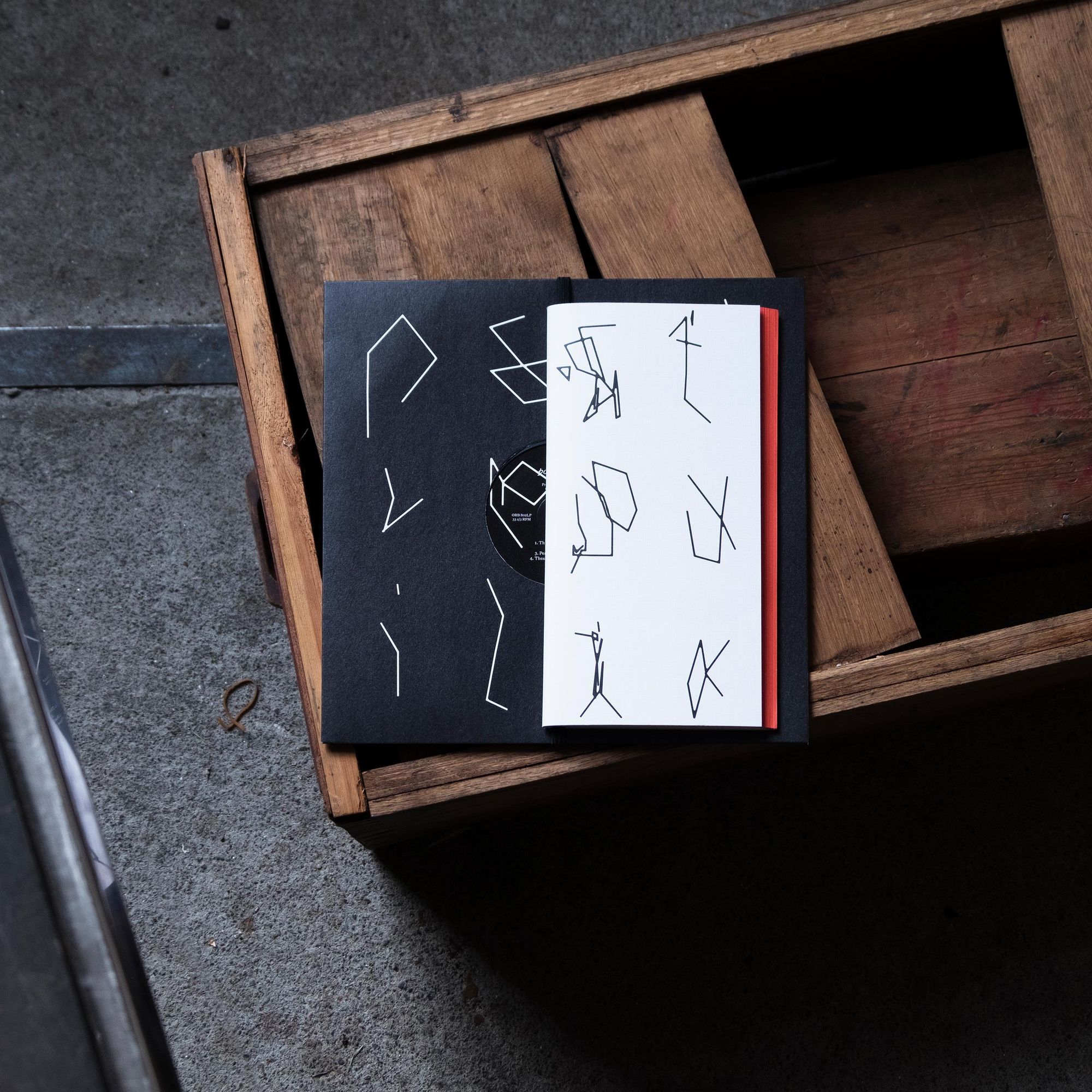
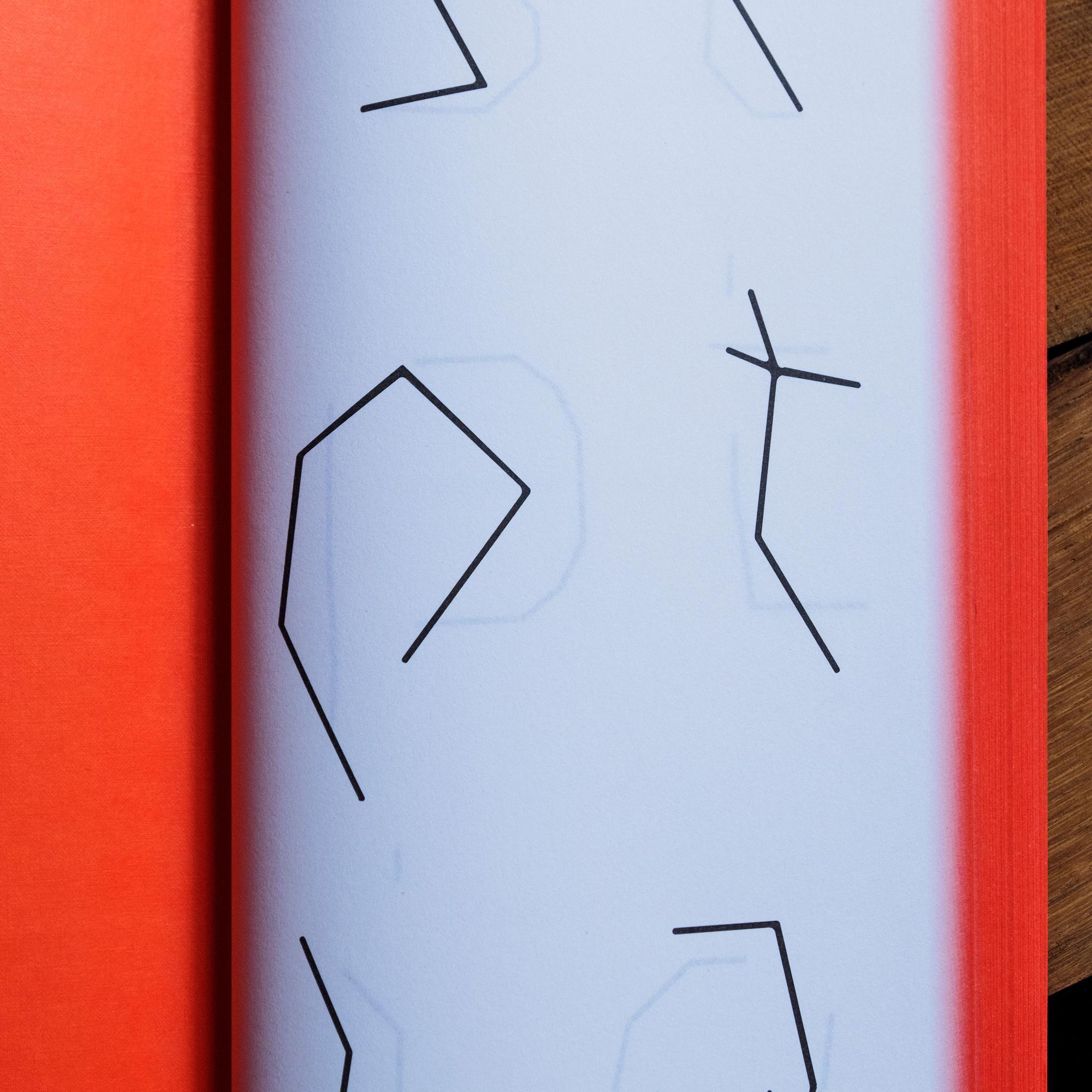
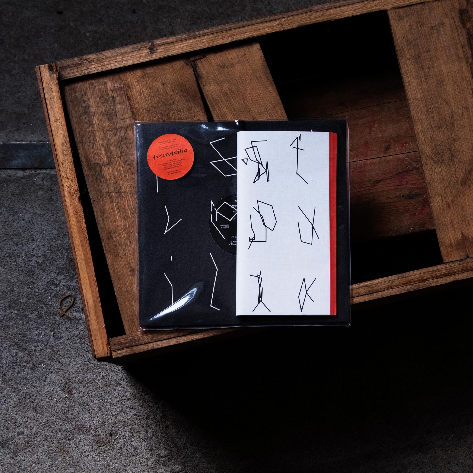
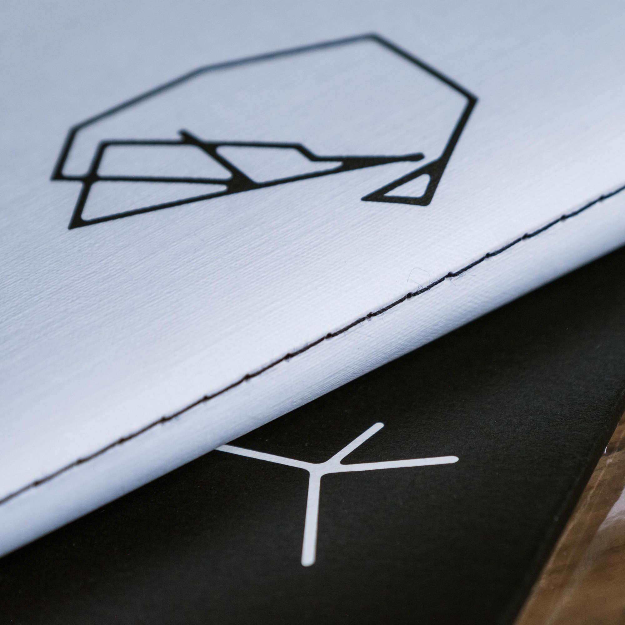
Postreptilia
2019
Info
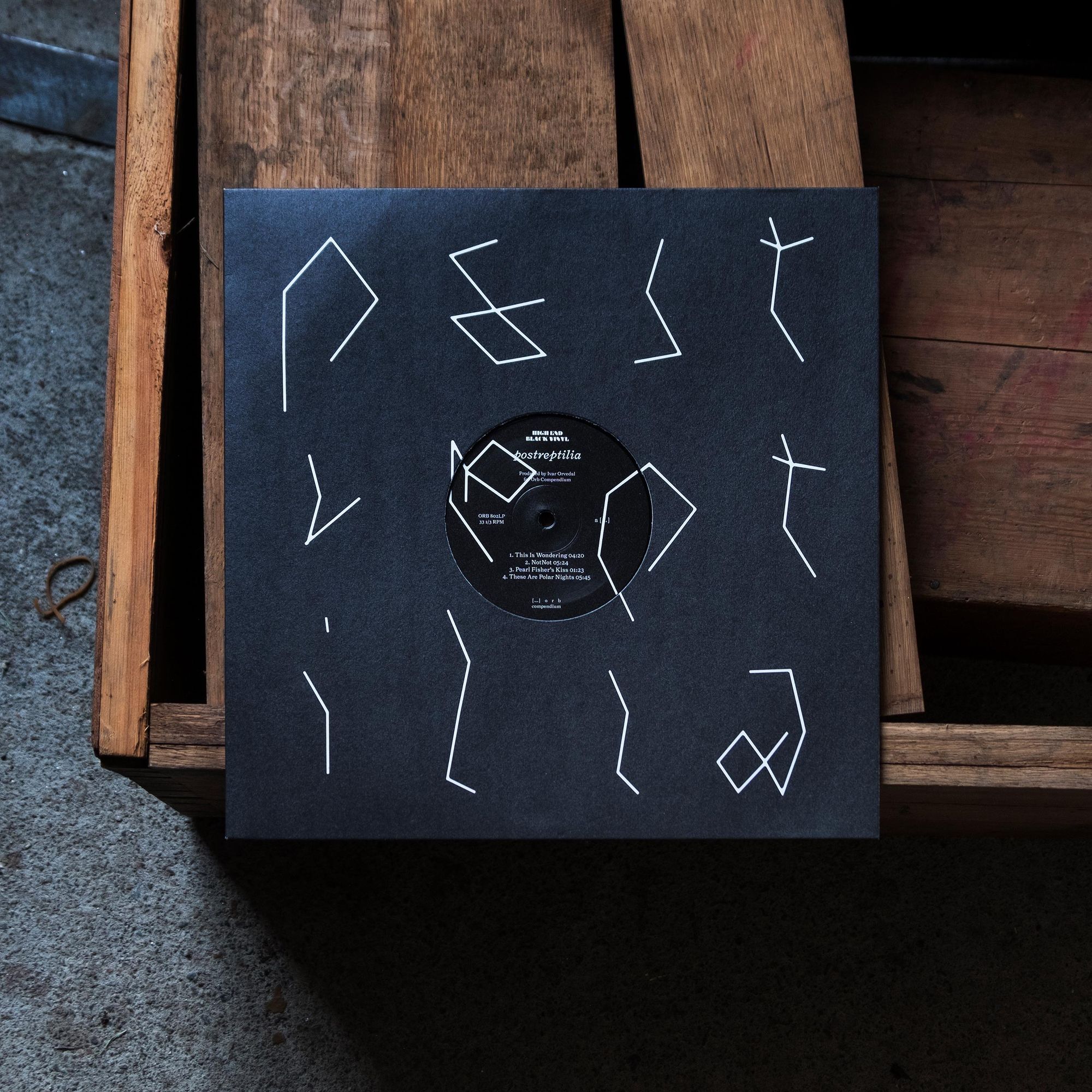
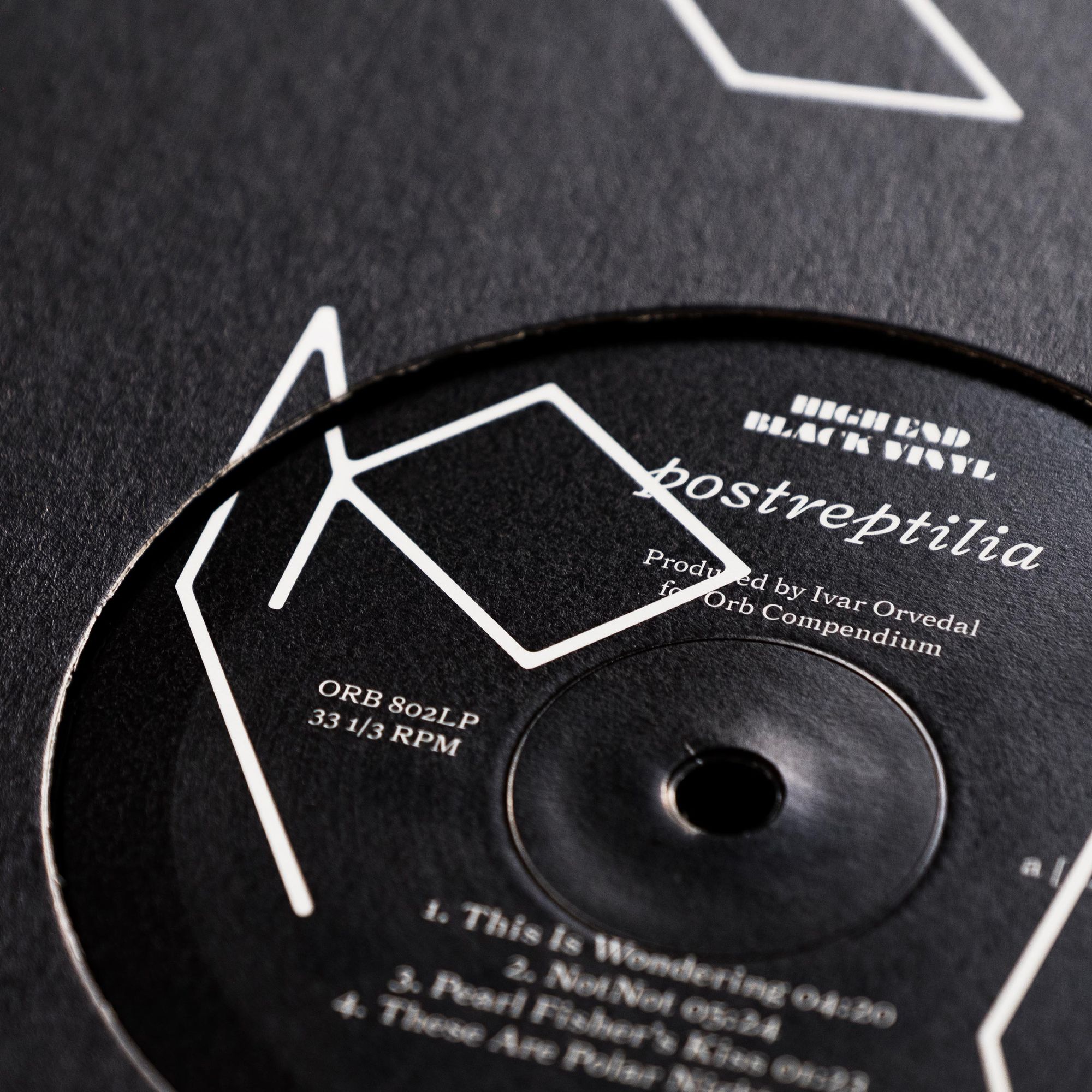
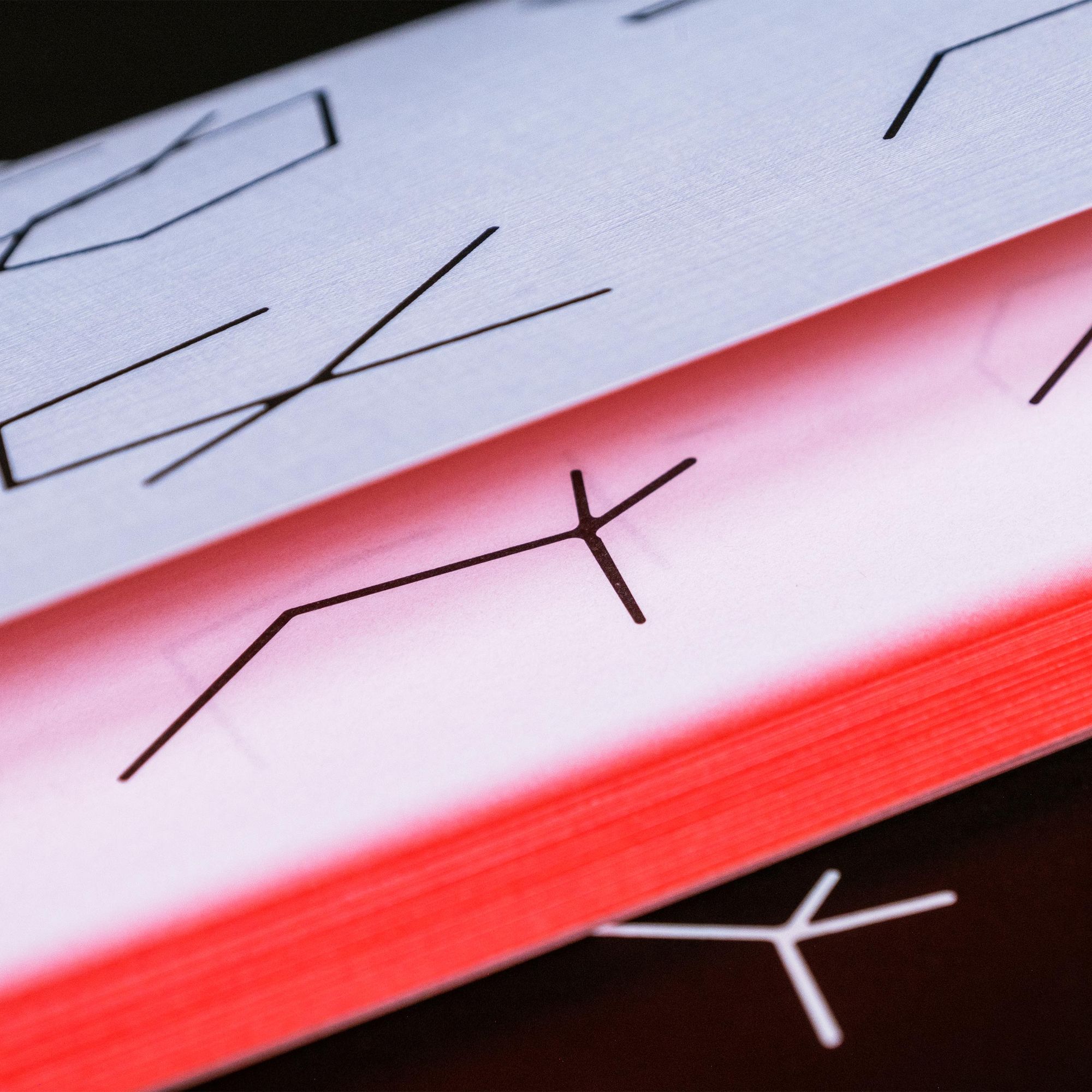
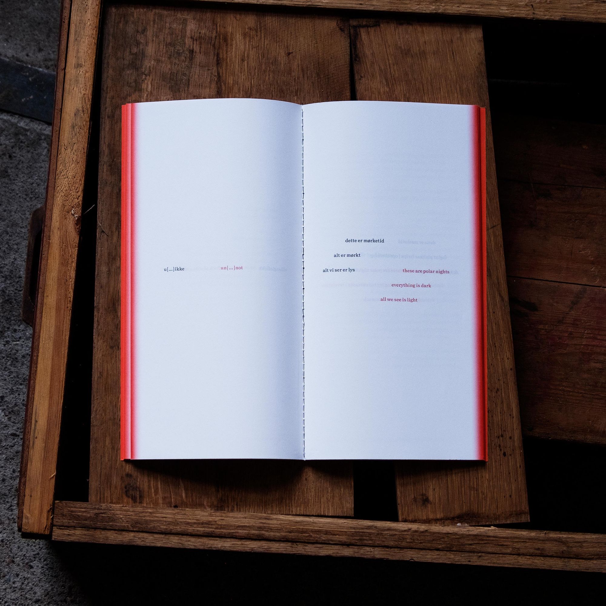
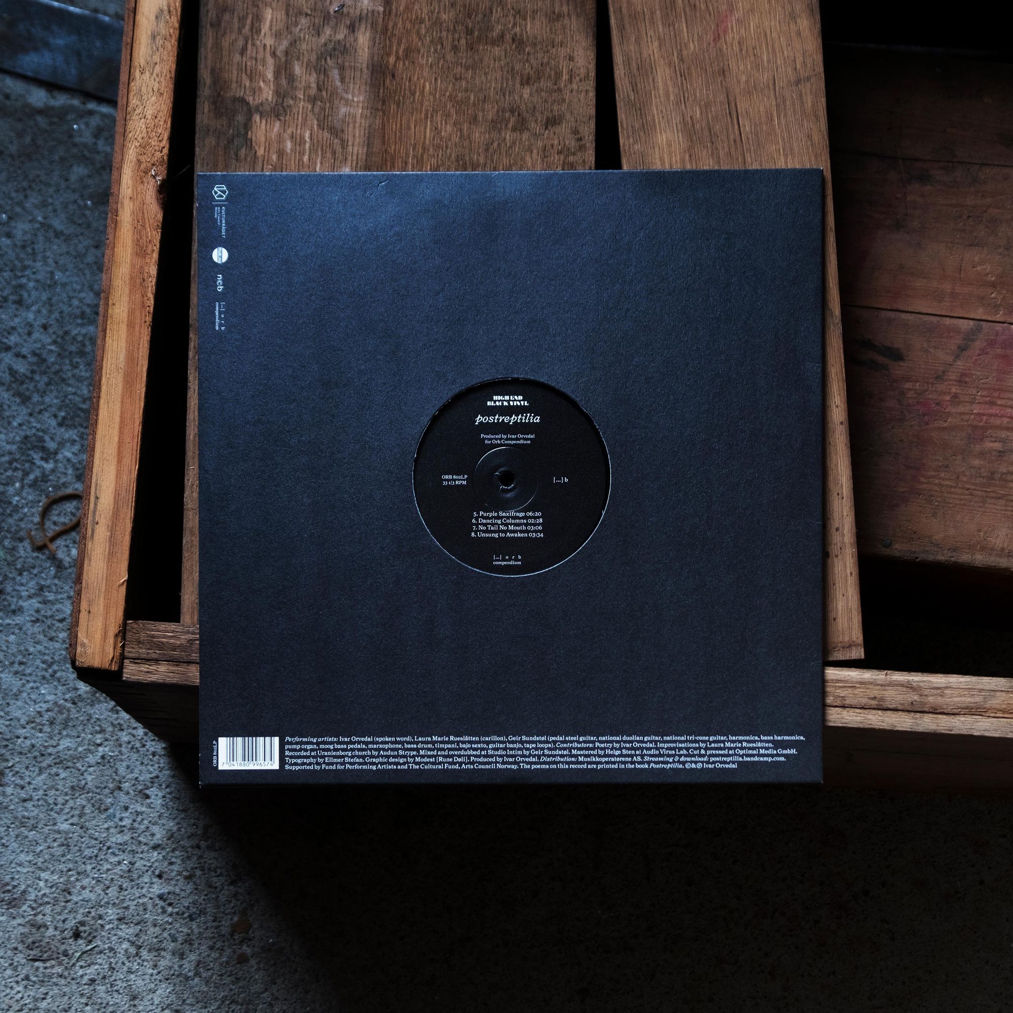
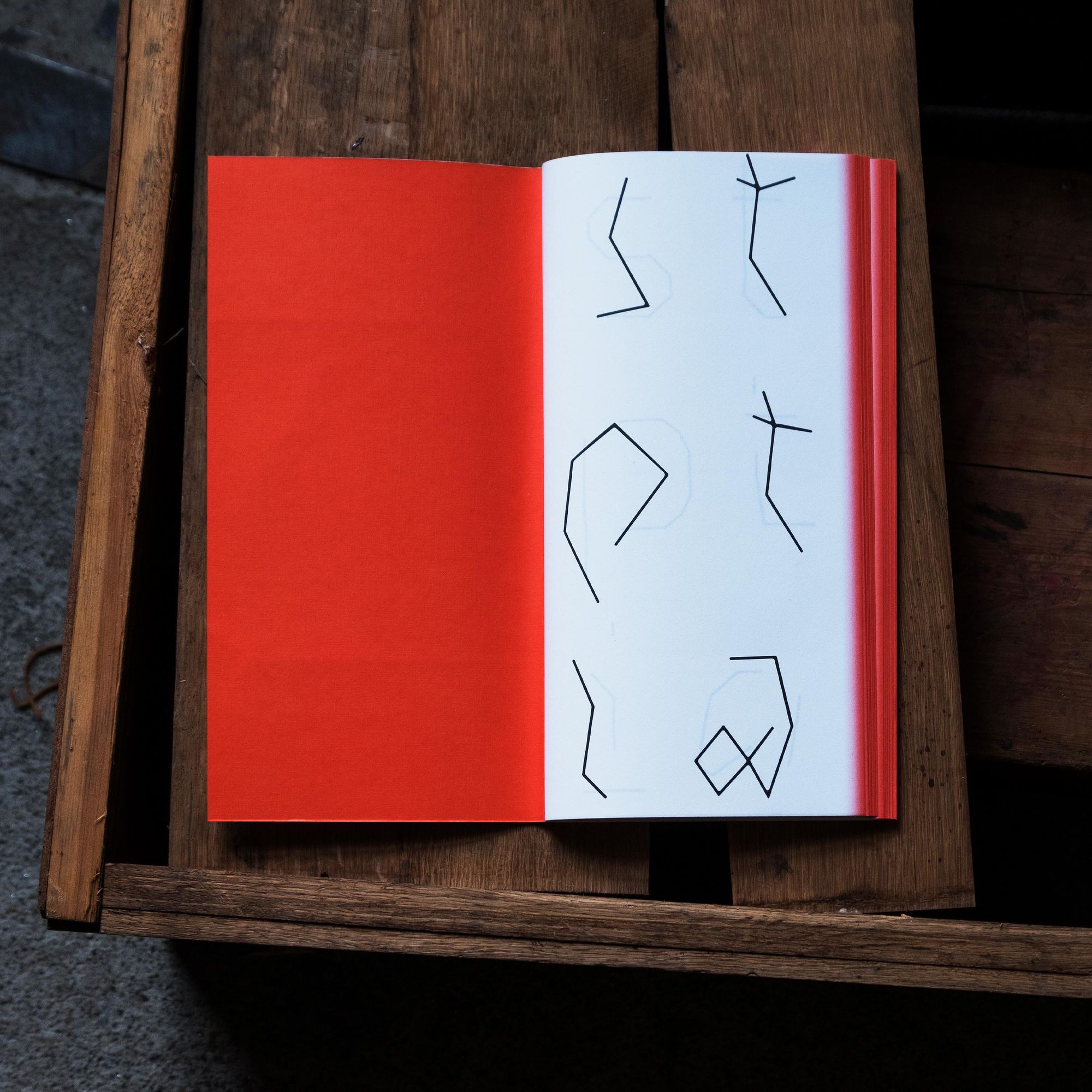
Postreptilia
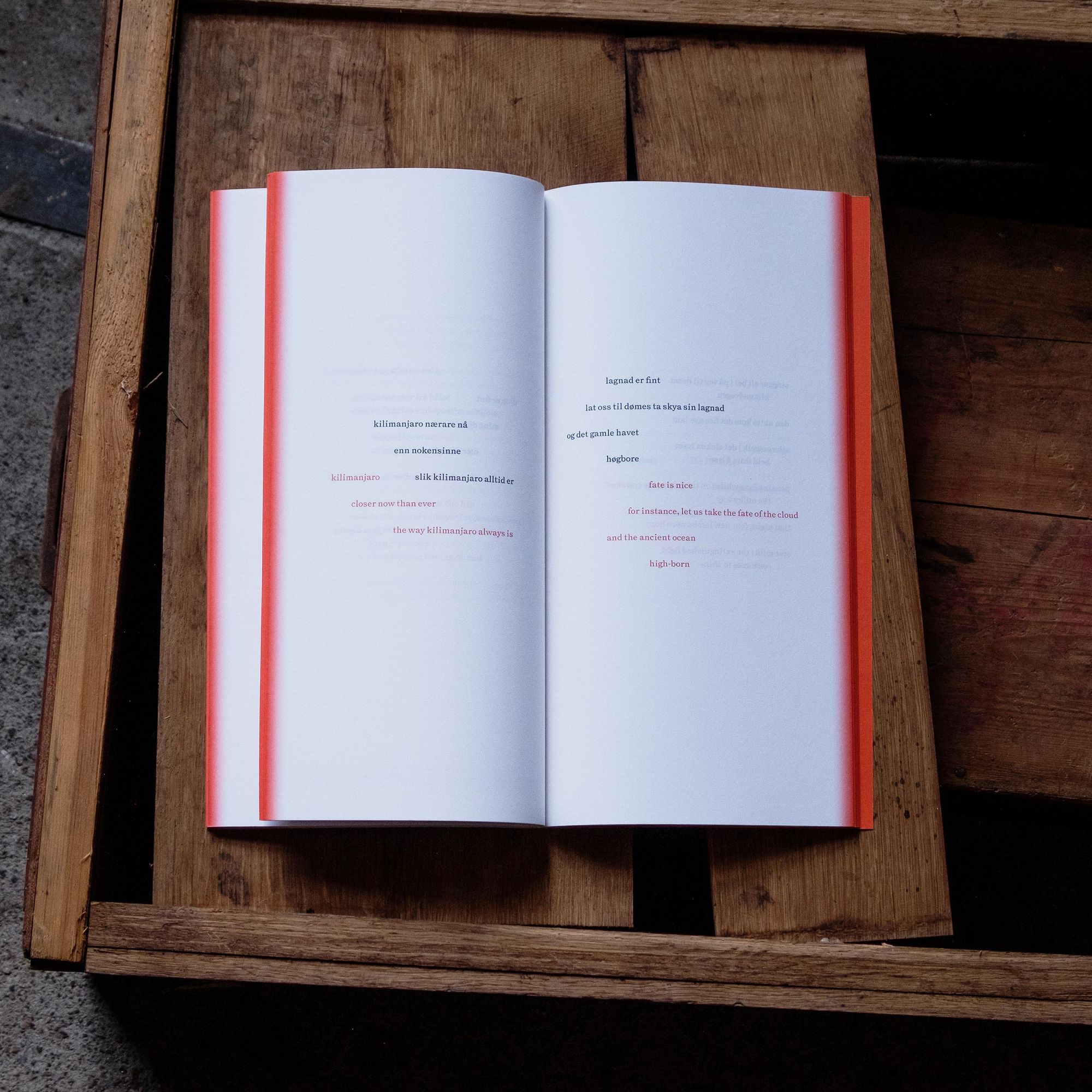
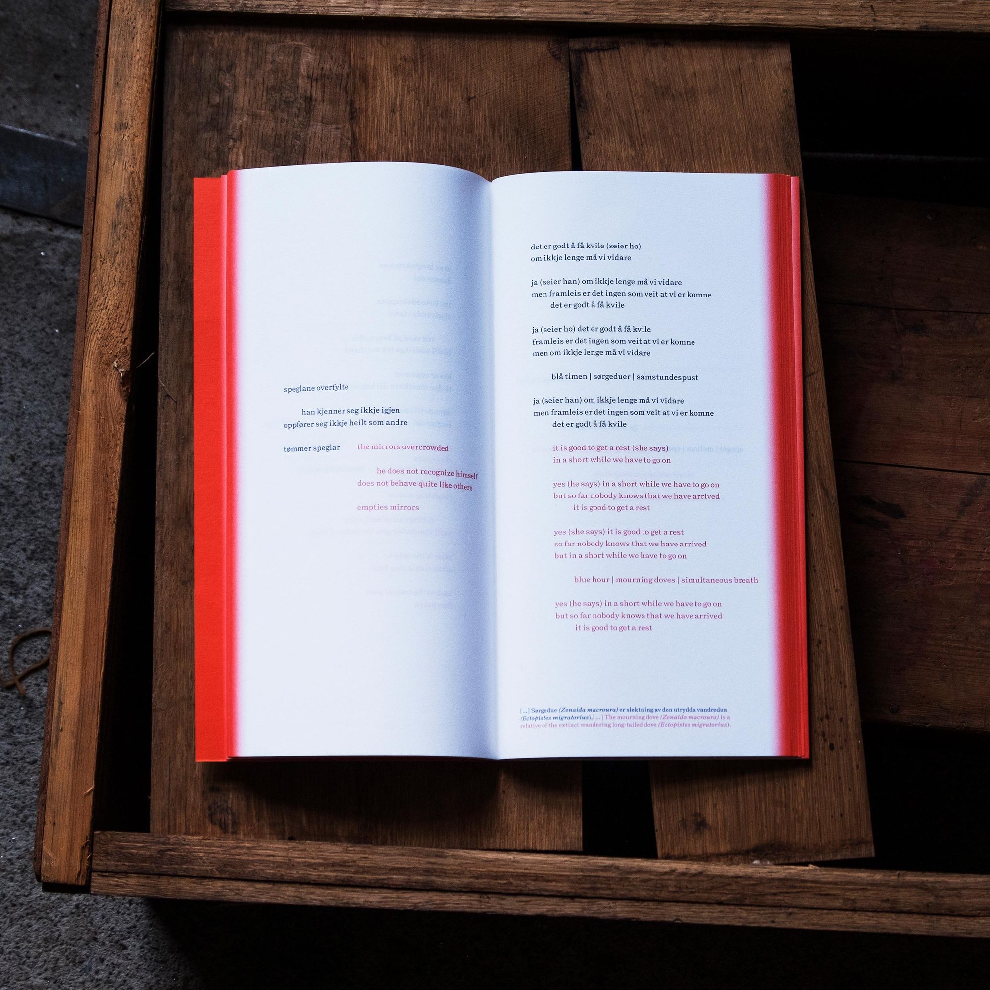
Ivar Orvedal has been active as a poet, musician and sound artist since the 1970s. Postreptilia is a multidimensional art project that explores the interplay between poems in their acoustic quality and the poems' typographic presentation in an accompanying book. The book contains the poems in Norwegian together with an English translation. The design and choice of materials is a result of collaboration between Ivar Orvedal, type designer Stefan Ellmer and Modest. Like the poetry, the design is inspired by archaic symbols. It is in Blombos Cave in South Africa that the oldest examples of intricate design of symbols have been found. These signs are 77 thousand years old and consist of straight lines carved into stone. We found a typographic translation of these forms in Omnigraph, a typeface designed by Ellmer in 2018. The typeface has several weights that range from pure technical precision to computer-generated distortion. It is used in different layers that move from abstract on the cover to more conventional typographic forms further into the book. We wanted to create an interplay in the poems, where the two languages were placed in variable positions on the same spread. The typeface Triptych, also designed by Ellmer (The Pyte Foundry), is used for the poems as a legible contrast to the abstract expression on the cover.
Year: 2019
Client: Ivar Orvedal
Type designer: Stefan Ellmer
Printers: Narayana Press (Denmark), Optimal Media (Germany)
Format: 146 × 280 mm
Printing Technique: Offset 2+2
Papers: Munken Print White 70 gsm, Peydur Feinleinen 220 gsm
Fonts: Triptych Roman, Omnigraf
Binding: Singer sewn
Pages: 152
Languages: Norwegian, English
Awards: Gold, Visuelt 2021 (Grafill), Silver, The Most Beautiful Norwegian Books 2021 (Grafill)
Jødenes historie
Forlaget Press
2019
Info
Jødenes historie
For decades, Oskar Mendelsohn worked on his immense manuscript about the history of Jews in Norway. Fifty years after the first volume was published, "The History of the Jews in Norway" is still the only complete documentation of Jewish life in Norway: a vital work on a crucial part of Norwegian history, and a classic in modern Norwegian history writing. Mendelshons text has previously been published in two volumes. The preliminary project was to see if we managed to get all 4 million characters into one book with a volume less than 1000 pages. Two columns for one thousand pages can easily become static. Footnotes instead of endnotes and a pretty simple indent system created a more varied expression. Several typographic choices are inspired by the Torah, for instance the distance between the text columns. GT Super is used throughout. All text pages are printed on 90 gsm Coral Book Ivory. The images are printed on 115 gsm Garda Matt. The cover is foil blocked on Setalux.
Year: 2019
Publisher: Forlaget Press
Editor: Håkon Harket
Printer: Printer Trento (Italy)
Repro: JK Morris (Sweden)
Format: 180 × 260 mm
Printing Techniques: Offset 1+1 and 4+4, Foilblocking White and Gold
Papers: Coral Book Ivory 90 gsm, Garda Matt 115 gsm
Fonts: GT Super, GT Super Display
Cloth: Setalux
Pages: 959
Language: Norwegian
Award: Silver, The Most Beautiful Norwegian Books 2020 (Grafill)
Alltid rabiat
Fagbokforlaget
2019
Info
Alltid rabiat
The book tells the story of Norwegian cybernetic Jens Glad Balchen and the development of the cybernetic way of thinking. The illustration is a portrait of Balchen drawn by Magnus Voll Mathiassen. The typeface Favorit Underlining is used for the title. The underlining emphasises the direction of the typography and Balchens gaze, and is placed at defined intervals starting from the center of the Balchen head. The cover is printed 4+0 on Geltex Silks with gold foil.
Year: 2019
Publisher: Fagbokforlaget
Editor: Andreas Nybø
Illustrator: Magnus Voll Mathiassen
Printer: John Grieg AS
Repro: John Grieg AS
Format: 170 × 230 mm
Printing Techniques: Offset 4+4, Foilblocking Silver
Papers: Munken Pure 100 gsm, Geltex Silks
Fonts: Favorit, Tiempos Text
Pages: 496
Language: Norwegian
Award: Silver, The Most Beautiful Norwegian Books 2020 (Grafill)
Apothekernes Laboratorium
Forlaget Press
2019
Info
Apothekernes Laboratorium
Apothekernes Laboratorium at Hoff in Oslo represents part of the old industrial culture in Oslo. The factory produced, among other things, antibiotics for livestock. Today, most of the factory has been demolished and replaced with new buildings for offices, shops, and residences. In 2015, photographer Dag E. Thorenfeldt documented the abandoned factory. The concept borders on being banal. Most of Thorenfeldt's photos were taken in landscape orientation. Therefore all the photos are rotated 90 degrees while keeping all typography in the normal reading direction. An approach that’s already established on the cover. The book is swissbound, and ABC Dinamo’s Favorit is used throughout.
Year: 2019
Publisher: Forlaget Press
Editor: Håkon Harket
Author: Erling Dokk Holm
Photographer: Dag E. Thorenfeldt
Printer: Printer Trento (Italy)
Repro: JK Morris (Sweden)
Format: 230 × 320 mm
Printing Techniques: Offset 4+4, Debossed image
Font: Favorit
Papers: Coral Book Ivory 100 gsm, Garda Premium Natural 170 gsm, Geltex
Binding: Swiss bound
Pages: 160
Language: Norwegian
Sjokoladeboka
Forlaget Press
2019
Info
Sjokoladeboka
For this book, confectioner Sverre Sætre has collected his best chocolate recipes. The book is structured into several chapters, containing approximately 100 recipes and a number of photographed step-by-step instructions. Photographer Tommy Andresen has taken the pictures. For the cover and chapter titles the typeface Domaine Display Medium Italic is used, where the typeface is rotated with the same degree of skew as the italics. Domaine is used throughout the book in several weights. The recipes are detailed and require a lot of space. Structuring the content with title and ingredients in the outer column gave enough room for both introduction and procedure the main column, with tips and tricks at the bottom. Giving the step-by-step instructions a consistent form was challenging because of the variation in the number of images that depended on the complexity of each recipe. By using a numbering system, these pages were given an identity and they were also clearly distinguished from the recipe pages.
Year: 2019
Publisher: Forlaget Press
Editor: Trygve Riiser Gundersen
Printer: Livonia Print (Latvia)
Repro: Italgraf Media (Sweden)
Format: 217 × 288 mm
Printing Techniques: UV Offset 4+4, Foilblocking Gold, UV Offset 4+0
Papers: Munken Lynx 120 gsm, Geltex, Geltex Silks
Fonts: Domaine Text, Domaine Display, Domaine Display Condensed
Binding: Hardcover halfbound
Pages: 256
Language: Norwegian
Pål Vigeland – When Metal Becomes Nature
arnoldsche Art Publishers
2019
Info
Pål Vigeland – When Metal Becomes Nature
Pål Vigeland has worked as a metal artist for nearly fifty years. Everything he has ever made, from jewelry and plates to public commissions and sculptures, has always been characterized by precision and stringency. This book shows the continuities between Vigeland’s earliest years and the present while also offering many surprises about the changes that have taken place along the way. The book is designed with parallel columns of Norwegian and English text. The main bulk of the book is printed on recycled paper as a comment to Pål’s reuse of materials in his sculptures.
Year: 2019
Client: Pål Vigeland
Publisher: arnoldsche Art Publishers (Germany)
Editor: Sonja Wiik
Printer: Offizin Scheufele (Germany)
Repro: Guri Dahl
Photo Editor: Guri Dahl
Format: 230 × 315 mm
Papers: Cyclus Offset 115 gsm, Arctic Volume Highwhite 130 gsm, Gmund f-Color Feinleinen
Printing Techniques: UV Offset 4+4, Offset 4+0
Fonts: Lyon Text, Lyon Display, Akkurat
Binding: Hardcover bound
Pages: 224
Languages: Norwegian, English
Feinschmecker
Forlaget Press
2018
Info
Feinschmecker
Feinschmecker has been one of Norway's leading restaurants for over 25 years. The book consists of signature recipes, as well as a number of short texts written by Morgenbladet's food critic, Knut Stene-Johansen. The photographs are taken by Lars Petter Pettersen. The cover is printed in black on a dark gray cloth (Cialux).
Year: 2018
Publisher: Forlaget Press
Editor: Trygve Riiser Gundersen
Photographer: Lars Petter Pettersen
Printer: Livonia Print (Latvia)
Repro: JK Morris (Sweden)
Format: 217 × 288 mm
Printing Techniques: UV Offset, Offset 4+4, Foilblocking
Paper: Munken Lynx 120 gsm
Font: Le Jeune
Cloth: Cialux
Binding: Hardcover bound
Pages: 303
Language: Norwegian
Award: Diploma, The Most Beautiful Norwegian Books 2019 (Grafill)
Kapp Hjertestein
Forlaget Press
2018
Info
Kapp Hjertestein
In 1921 Roald Amundsen brought two small girls from East Siberia to Norway. The two learned to speak Norwegian, went to Norwegian school and got Norwegian friends. They were the closest Roald Amundsen ever came to a family of his own. But in December 1924 he suddenly sent the girls away. Basically this is a textbook, but the author, Espen Ytreberg, had also found a number of photos documenting the story. The photos have no captions, but follow the text closely, which made the design challenging. To solve this, all images were consistently placed at the bottom of the page. This allowed the following paragraph to be moved to the next page without appearing out of place.
Year: 2018
Author: Espen Ytreberg
Publisher: Forlaget Press
Editor: Trygve Riiser Gundersen
Printer: Livonia Print (Latvia)
Repro: JK Morris (Sweden)
Format: 140 × 220 mm
Printing Techniques: Offset 1+1 and 4+4, Foilblocking Silver
Papers: Munken Premium Cream 100 gsm, Geltex
Font: GT Super
Binding: Hardcover with dust jacket
Pages: 224
Language: Norwegian
Award: Diploma, The Most Beautiful Norwegian Books 2015 (Grafill)
Kunstnerliv
Wad/Muri
2018
Info
Kunstnerliv
The book contains interviews of 19 norwegian artists. The interviews are done by Anne Marit Muri, the portraits are by Bjørn Wad. The fact that all prodution of this book is done in Norway, from texts, to photo, postproduction, design, print and binding makes this book rather unique.
Year: 2018
Photographer: Bjørn Wad
Editor: Anne Marit Muri
Publisher: Wad/Muri
Printer: Rolf Ottesen (Norway)
Repro: Postproduksjon
Format: 240 × 300 mm
Printing Techniques: Offset 4+4, Foilblocking Black
Paper: Arctic Volume Ivory 130 gsm
Fonts: Domaine Text, Domaine Display
Cloth: Canvas Extra
Binding: Hardcover bound, Sticker
Pages: 400
Language: Norwegian
Award: Gold, The Most Beautiful Norwegian Books 2019 (Grafill)
The Security Council Chamber
Forlaget Press
2018
Info
The Security Council Chamber
The interior of the Security Council Chamber was designed by the Norwegian architect Arnstein Arneberg. The materials were supplied by Norwegian producers and the painting is by Norwegian painter Per Krogh. In 2011, the UN building was restored, including the Security Council Chamber. The Norwegian Directorate for Cultural Heritage was involved in the restoration precess. The book is a collaboration between the Directorate for Cultural Heritage and the National Museum of Architecture. The book is also part of Norway's application for membership in the Security Council in 2022. Photographer Ivan Brodey was comissioned to take all the new photographs for the book.
Year: 2018
Clients: The Directorate for Cultural Heritage, National Museum – Architecture
Publisher: Forlaget Press
Editor: Jørn Holme
Photographer: Ivan Brodey
Repro: Postproduksjon, JK Morris (Sweden)
Printer: Printer Trento (Italy)
Photo Editor: Tone Svinningen
Format: 240 × 300 mm
Printing Techniques: Offset 4+4, Foilblocking White
Papers: Gardamatt Smooth 170 gsm, Tauro Offset 120 gsm
Font: GT America
Binding: Hardcover halfbound
Cloth: Cialinnen
Pages: 224
Languages: Norwegian, English
Award: Silver, The Most Beautiful Norwegian Books 2019 (Grafill)
J.C. Dahl – The Power of Nature
KODE Bergen
2018
Info
J.C. Dahl – The Power of Nature
The catalog was published for the exhibition J.C. Dahl – The Power of Nature at KODE Bergen. J.C. Dahl was Norway's first art painter of international importance. The catalog contains 10 academic articles on Dahl's art, in addition to a large selection of works that includes paintings, drawings and cloud studies. The body text is set in Le Jeune, all meta information is set in GT America. The cloud studies are printed on one gatefold. The cover is bound with cloth in two different colors for the respective languages. The picture is foiled with a glossy PP foil to create a contrast to the books cloth.
Year: 2018
Publisher: KODE Bergen (Norway)
Editors: Line Daatland, Torunn Myrva
Printer: Göteborgstryckeriet (Sweden)
Repro: JK Morris (Sweden)
Format: 245 × 300 mm
Printing Techniques: UV Offset, Foilblocking Silver, Glued laminated image
Papers: Munken Pure 130 gsm, Arctic Volume Ivory 150 gsm
Fonts: GT America, Le Jeune
Cloth: Assuan
Binding: Hardcover bound
Pages: 312
Languages: Norwegian, English
Award: Gold, The Most Beautiful Norwegian Books 2019 (Grafill)
Art and Architecture at the University of Bergen
Fagbokforlaget
2017
Info
Art and Architecture at the University of Bergen
Norway’s first real art collection was established in Bergen in 1825. It formed the basis for the University of Bergen s unique cultural and natural history collections, which gradually moved from various temporary premises to purpose-built museum buildings. The book traces the history of the art and architecture on and around the Bergen University campus, from the church art to the buildings and their artworks, and street art.
Year: 2017
Publisher: Fagbokforlaget
Editor: Dag Grønnestad
Printer: John Grieg AS
Repro: JK Morris (Sweden)
Format: 160 × 240 mm
Printing Techniques: Offset 4+4, Offset 1+0, Screen Printing White
Paper: Munken Lynx Rough 120 gsm
Fonts: Neue Haas Grotesk, Tiempos Text
Binding: Hardcover bound
Pages: 262
Languages: Norwegian, English
Magne Furuholmen – Imprints
Forlaget Press
2017
Info
Magne Furuholmen – Imprints
The book is about the production and completion of Magne Furuholmens sculpture park Imprints at Fornebu. Imprints is the largest park with ceramic sculptures in Scandinavia. The book is divided into three parts. The first part shows the finished park. The second contains Furuholmen's poems. The book's main part is a photographic documentation of the production phase. The three parts are separated by different paper qualities emphasizing the specific content. The book is swiss bound, the cover is covered with soft touch laminate and the box is produced with a reasonable but solid black corrugated board.
Year: 2017
Publisher: Forlaget Press
Editor: Thor Arvid Dyrerud
Printer: Göteborgstryckeriet (Sweden)
Repro: JK Morris (Sweden)
Artist: Magne Furuholmen
Format: 210 × 280 mm
Printing Techniques: UV Offset 4+4, Foilblocking White
Papers: Arctic Volume White 130 gsm, Munken Print Cream 80 gsm, Munken Lynx Rough 120 gsm
Fonts: Circular, GT Pressura Mono
Binding: Hardcover with soft touch laminate, Swiss bound, Slip case of Black Microwell
Pages: 352
Language: English
Kitty Kielland
Uten tittel
2017
Info
Kitty Kielland
This catalog was published for with the exhibition Open Air – Kitty L. Kielland at Stavanger Art Museum, MUST. The catalog contains the bulk of Kielland's most important works. The book is divided into three sections printed on three different paper qualities. A text section, a catalog section, and an appendix which includes an english translation.
Year: 2017
Publisher: Uten tittel
Editor: Inger M. L. Gudmundson
Client: MUST – Museum Stavanger
Printer: Göteborgstryckeriet (Sweden)
Repro: JK Morris (Sweden)
Format: 250 × 300 mm
Printing Techniques: UV Offset 4+4, Foilblocking White
Papers: GardaPat Klassika 130 gsm, Munken Pure 130 gsm, Colorit 120 gsm, Geltex
Fonts: Thesaurus Text, Thesaurus Display
Binding: Hardcover halfbound
Cloth: Fancy Linen
Pages: 302
Languages: Norwegian, English
Bokstavene i historien
Forlaget Press
2017
Info
Bokstavene i historien
Bokstavene i historien (Letters in History) highlights the development of letterforms in a general-historical context. How the letters in use changed along with the cultural and social developments in Europe. Because of its essential historical role and ist many well-preserved examples, Rome is the starting point. The author, Øyvin Rannem, spent nearly 12 years writing and collecting the material for this book. The reason for chosing a small format and single column was resulted by the text’s structure and the variable image quality. In order to create a consistant design, all pictures are presented in black and white. In the book, text and pictures are closely linked, led by image references in the text. All image and text references are printed with Pantone Bright Red U. The typography on the cover is inspired by the inscription on Trajan's Column, perhaps the most famous example of Roman square capitals.
Year: 2017
Publisher: Forlaget Press
Editor: Finn Totland
Printer: Printer Trento (Italy)
Repro: JK Morris (Sweden)
Format: 160 × 240 mm
Printing Technique: Offset 2+2
Papers: Munken Print White 100 gsm, Munken Pure 300 gsm
Fonts: Lyon Text, Lyon Display, Neutral, Johnston STD, Trajan
Binding: Softcover with flaps
Pages: 390
Language: Norwegian
Award: Gold, The Most Beautiful Norwegian Books 2018 (Grafill)
The Young Lions
Preus Museum
2017
Info
The Young Lions
This is the catalog and exhibition graphics following Preus Museums exhibition The Young Lions. The exhibition celebrates the fortieth anniversary of Fotogalleriet, the Oslo-based gallery that has been at the forefront of establishing photography as an artistic medium in Norway. The catalog is saddle stitched and given a large magazine format. The content is rotated in order to encourage the reader to fold the catalog and read while walking through the exhibition. The exhibition identity is inspired by the focus area in the viewfinder of an older camera.
Year: 2017
Publisher: Preus Museum (Norway)
Editors: Hege Oulie, Kristian Skylstad
Design assistant: Henrik Hjorth Austad
Printer: Zoom Grafisk
Repro: Andreas Harvik, Hege Oulie
Format: 240 × 350 mm
Printing Technique: Offset 4+4
Papers: Munken Premium Cream 100 gsm, Arctic Silk+ 130 gsm
Font: F Grotesk
Pages: 44
Language: Norwegian
Edda
Skald
2017
Info
Edda
The poems of what is today called The Elder Edda had existed in folk tales for centuries before they were written down in the 13th and 14th centuries. Together with Snorre’s Edda (The Younger Edda), the collection of poetry has been the most central work in Norse mythology. This scenic version is written and modernized by Jon Fosse and is based on several of the well-known poems. The tyopgraphy of the cover is inspired by capital letters found in the manuscript of Edda (Codex Regius) and was drawn specific for this book by type designer Stefan Ellmer.
Year: 2017
Publisher: Skald
Editor: Simone Stibbe
Author: Jon Fosse
Type designer: Stefan Ellmer
Printer: Livonia Print (Latvia)
Format: 120 × 160 mm
Printing Techniques: Offset 1+1, Foilblocking Yellow
Papers: Munken Print Cream 100 gsm, Geltex
Fonts: Tiempos Text, Neue Haas Grotesk
Pages: 176
Language: Norwegian
Awards: Gold, The Most Beautiful Norwegian Books 2018 (Grafill), Silver, The Most Beautiful Norwegian Books 2018 (Grafill)
Gyldendals juridiske kommentarserie
Gyldendal
2017
Info
Gyldendals juridiske kommentarserie
Gyldendals juridiske kommentarserie is a series of law commentaries written by practicing lawyers. The book cover series was co-designed with Levi Bergqvist. The concept is based on a simple indent system often found in online comment fields. The design includes an extensive color palette that creates a variety within the series.
Year: 2017
Publisher: Gyldendal
Co-designer: Levi Bergqvist
Editors: Gro Trude Gjestrud, Ida Kyhring, Anne Birgitte Songe
Printer: Dimograf (Poland)
Format: 170 × 240 mm
Language: Norwegian
Award: Silver, The Most Beautiful Norwegian Books 2019 (Grafill)
Innerå + Bø
BIE Media
2016
Info
Innerå + Bø
This books focus is tradition and knowledge on local Norwegian produce and how to prepare them in the best way. Knowledge was the key word which led to the choice of scientific illustrations. Where better to find knowledge on plants than in a botanical atlas? The wide format was a result of Sune Eriksens photographs. The format also has the advantage of letting the book opening completely. The layout of recipes is similar, except for the asymmetric and variable alignment of titles and placement chef's comments. A yellow tone is printed on all backgrounds to highlight white elements in the food photographs.
Year: 2016
Publisher: BIE Media
Authors: Kari Innerå, Merete Bø
Photographer: Sune Eriksen
Illustrators: ByHands/Meritxell Campos Canudas, ByHands/Carles Puche Rius
Printer: Livonia Print (Latvia)
Repro: Marius Viken, JK Morris (Sweden)
Format: 300 × 220 mm
Printing Techniques: UV Offset 4+4, Foilblocking Black
Papers: Munken Lynx 130 gsm, Geltex Silks
Fonts: Tiempos Text, LL Brown
Binding: Hardcover bound
Pages: 336
Language: Norwegian
Awards: Gold, The Most Beautiful Norwegian Books 2017 (Grafill), Silver, The Most Beautiful Norwegian Books 2017 (Grafill)
Riksrevisjonens historie 1816–2016
Fagbokforlaget
2016
Info
Riksrevisjonens historie 1816–2016
On June 22, 1816, the Norwegian Parliament elected five state auditors. This marks the starting point for Riksrevisjonens 200-year history. The book describes how the Riksrevisjonen was organised and worked, and discusses the reasons why the institution's importance has varied.
Year: 2016
Publisher: Fagbokforlaget
Editor: Dag Grønnestad
Design assistant: Henrik Hjorth Austad
Printer: John Grieg AS
Photo Editor: Tone Svinningen
Typesetter: Laboremus Oslo
Format: 217 × 288 mm
Printing Techniques: Offset 4+4, Foilblocking Silver, Glued image
Paper: Munken Lynx 120 gsm
Fonts: Lyon Text, Neue Haas Grotesk
Cloth: Brillianta
Binding: Hardcover bound
Pages: 520
Language: Norwegian
Bård Breivik – I’d love the key to the master lock
arnoldsche Art Publishers, Fagbokforlaget
2016
Info
Bård Breivik – I’d love the key to the master lock
This project began as early as in 2008, with the intention to become a monograph about the Norwegian artist Bård Breivik's life and artistry. More than 40,000 pictures and some 40+ text contributions were already collected when I became involved towards the end of 2013. Together with Rita Leppiniemi, Guri Dahl and Bård, I founded the premises for presenting the material. The process that followed, a mix between design, text and image editing, led to the content being collected in one large chronological book and a smaller book focusing on the project Score for a Longer Conversation. Mathematics and the duodecimal system had always played a major role in Bård's artistry. I used this as the basis for the book's format, which has a ratio of 3:4. The book's grid system and system for selecting point sizes were also defined accordingly. Texts were divided into 3 categories, where dialogue, academic articles and texts written by colleagues/friends all have different designs within the same system.
Year: 2016
Publishers: arnoldsche Art Publishers (Germany), Fagbokforlaget
Editors: Rita Leppiniemi, Jorunn Veiteberg
Printer: Göteborgstryckeriet (Sweden)
Repro: Guri Dahl
Photo Editor: Guri Dahl
Format: 190 × 253 mm
Printing Techniques: UV Offset 4+4, Foilblocking Silver, Blind debossing, UV Offset 4+4
Papers: Munken Pure 90 gsm, Arctic Silk+ 80 gsm, Efalin Feinleinen 280 gsm
Fonts: Tiempos Text, Tiempos Headline, Larish Neue, Pitch, Neutral
Cloth: Comtesse
Binding: Hardcover bound, Softcover with flaps, Slipcase
Pages: 1294
Languages: Norwegian, English
Award: Book of the Year, The Most Beautiful Norwegian Books 2017 (Grafill)
The Storting
Forlaget Press
2016
Info
The Storting
The Storting building celebrated its 150th anniversary in 2016. By placing the chapters in a specific sequence, both text and Ivan Brodey’s photographs act as a guided tour through the building. The idea was to create a clear distinction between historical and new images. All Brodey’s photographs are placed in front of each chapter as a visual introduction to the specific area. All historical pictures are presented in black and white.
Year: 2016
Publisher: Forlaget Press
Editor: Trygve Riiser Gundersen
Photographer: Ivan Brodey
Printer: Livonia Print (Latvia)
Repro: Postproduksjon, JK Morris (Sweden)
Photo Editor: Tone Svinningen
Format: 236 × 310 mm
Paper: Munken Lynx 130 gsm
Printing Technique: UV Offset 4+4
Fonts: Le Monde Livre Classic, Requiem
Binding: Hardcover quarter bound
Pages: 312
Languages: Norwegian, English
Award: Diploma, The Most Beautiful Norwegian Books 2017 (Grafill)
En fotohistorie
Forlaget Press, Preus Museum
2015
Info
En fotohistorie
Preus museum in Horten owns the most profiled image collection in Norway. Twenty years ago, the Norwegian Government purchased the collection after photo enthusiast Leif Preus, a collection consisting of both photographs, technical equipment and an extensive library. Preus Museum has since then served as a national photo museum covering photography from its very beginning. The book documents a variety of elements from the museums large collection, focusing on both technology, culture and art development within photography.
Year: 2015
Publisher: Forlaget Press
Editor: Thor Arvid Dyrerud
Printer: Printer Trento (Italy)
Repro: JK Morris (Sweden)
Photo Editor: Preus Museum (Norway)
Format: 240 × 303 mm
Printing Techniques: Offset 4+4, Foilblocking Black
Papers: Ultramatt 150 gsm, Tauro Offset 120 gsm, Geltex
Font: Neutral
Binding: Hardcover with dust jacket
Pages: 468
Language: Norwegian
Award: Silver, The Most Beautiful Norwegian Books 2016 (Grafill)
Art in Battle
KODE Bergen
2015
Info
Art in Battle
During WW2, the Nazis used both Norwegian and foreign works of art as part of their extensive propaganda. KODE Bergen's exhibition "Art in Battle" opened autumn 2015, where parts of the exhibition «Kunst og Ukunst» (Art and Non-Art) was recreated. The original exhibition took place in Bergen during WW2 in order to promote the Nazi art ideology. Works that were considered harmful to the public were shown to inflame public opinion against modernism. The catalog also presents examples of what was looked upon as good art by the Nazis. In addition to the art the catalog contains academic articles written for a series of lectures arranged by KODE Bergen in 2014.
Year: 2015
Co-designer: Daniel Bjugård
Publisher: KODE Bergen (Norway)
Editor: Frode Sandvik
Printer: Göteborgstryckeriet (Sweden)
Format: 160 × 240 mm
Printing Techniques: UV Offset 4+4, Blind debossing
Papers: Munken Polar 130 gsm, Munken Print Cream 115 gsm, Munken Pure 300 gsm
Fonts: Lyon Text, Lyon Display, Akkurat Mono
Binding: Slip case of 380 gsm Curious Matter Désirée Red
Pages: 254
Languages: Norwegian, English
Awards: Gold, The Most Beautiful Norwegian Books 2016 (Grafill), Diploma, Swedish Book Art 2016 (The Swedish Book Arts Association)
Stortingets historie 1964–2014
Fagbokforlaget
2014
Info
Stortingets historie 1964–2014
The book is published as part of the Norwegian constitution's 200th anniversary and tells the story of the previous 50 years in the Storting's history. The pictures are placed on either full bleed pages or spreads to emphasize the importance of the various events. The images also have comprehensive captions, allowing the book to be read in several ways. The book also contains a vast number of graphs and tables that are extracted from the text and given space on seperate pages on pink background.
Year: 2014
Publisher: Fagbokforlaget
Editors: Tore Grønlie, Dag Grønnestad
Printer: John Grieg AS
Repro: Postproduksjon
Photo Editor: Tone Svinningen
Format: 217 × 289 mm
Printing Techniques: Offset 4+4, Offset 1+0
Papers: Munken Pure 120 gsm, Geltex
Font: Le Monde Livre Classic
Binding: Padded hardcover
Pages: 608
Language: Norwegian
Award: Silver, The Most Beautiful Norwegian Books 2015 (Grafill)
The Dahmer Syndrome/A Thing of Beauty
Spriten Forlag
2014
Info
The Dahmer Syndrome/A Thing of Beauty
The book was launched at the premiere of two plays at Black Box in Oslo August 2014. A Thing of Beauty is mass murderer Jeffrey Dahmer's story. The Dahmer Syndrome is the story of his victims. Both written by Malmfrid Hallum. The idea was to create a clear contrast between the two texts and to emphasise the different voices. The mass murderer's almost innocent view of his deeds on a white background with a roman. The victims' voices are printed negative with a grotesque. The vulnerability of the pieces are emphasised by the lack of a book cover. The red thread used to sew the signatures is to highlight the book's theme.
Year: 2014
Publisher: Spriten Forlag
Author: Malmfrid Hallum
Editor: Tom Erik Lønnerød
Printer: Elanders Fälth & Hässler (Sweden)
Format: 133 × 188 mm
Printing Technique: Offset 1+1
Papers: Munken Print White 115 gsm, Geltex
Fonts: LeMonde Livre Classic, Maax
Binding: Belly band
Pages: 96
Language: English
Award: Silver, The Most Beautiful Norwegian Books 2015 (Grafill)
En forsvunnet by
Forlaget Press
2014
Info
En forsvunnet by
In 1914, the Jubilee Exhibition, which marked the 100-year celebration of the Norwegian Constitution, was arranged in the area that we today know as the Frogner Park. The book is a guided walk through what is still the most visited event in Norwegian history. Each chapter addresses a geographical location using text, images and relevant articles extracted from the media that covered the event.
Year: 2014
Author: Espen Ytreberg
Publisher: Forlaget Press
Editor: Trygve Riiser Gundersen
Printer: Elanders Fälth & Hässler (Sweden)
Repro: Elanders Fälth & Hässler (Sweden)
Photo Editor: Guri Dahl
Format: 150 × 210 mm
Printing Technique: Offset 4+4
Paper: Munken Pure Rough 100 gsm
Fonts: Domaine Text, Domaine Display
Binding: Hardcover with dust jacket
Pages: 398
Language: Norwegian
Award: Diploma, The Most Beautiful Norwegian Books 2015 (Grafill)
Søren Kierkegaard – Den fromme spotteren
Forlaget Press
2013
Info
Søren Kierkegaard – Den fromme spotteren
Dust jacket and cover for Trond Berg Eriksens book. The illustration of Kierkegaard was found in the magazine Corsaren from 1846. In the original illustration, Kierkegaard is surrounded by objects that represent his thought universe orbiting the philosopher. The objects were replaced by the typography, where all the text on front, spine, back and flaps rotate around the axis, which is Kierkegaard. The cover is in red Geltex creating a contrast to the blue dust jacket.
Year: 2013
Publisher: Forlaget Press
Author: Trond Berg Eriksen
Editor: Thor Arvid Dyrerud
Printer: Bookwell AB (Finland)
Format: 136 × 200 mm
Language: Norwegian
Award: Diploma, The Most Beautiful Norwegian Books 2014 (Grafill)
Cindy Sherman — Untitled horrors
Hatje Cantz
2013
Info
Cindy Sherman — Untitled horrors
The catalog was designed together with Stefania Malmsten for Cindy Shermans exhibition Untitled Horrors at Astrup Fearnley Museet (Oslo), Moderna Museet (Stockholm) and Kunsthaus Zürich. The catalog is edited and published in four language editions (Norwegian, Swedish, English and German) by Moderna Museet in collaboration with Hatje Cantz Verlag. The catalog contains 135 of Shermans works, ranging from 1975 to 2013. The texts were defined as own works, and chose to separate text and images. The texts varied widely, so we developed a system based on four different point sizes and a flexible type area. This helped us deal with the four language editions. Separating text and image was also converted to the cover by turning the flaps. As none of Sherman's works could be cropped, we introduced an introduction where some of the images are presented in full bleed.
Year: 2013
Co-designer: Stefania Malmsten
Client: Moderna Museet
Publisher: Hatje Cantz (Germany)
Editor: Lena Essling
Printer: Firmengruppe Appl, aprinta druck (Germany)
Repro: Repromayer GmbH (Germany)
Format: 217 × 280 mm
Printing Technique: Offset 5+5
Font: TimesMM
Paper: Chromocard 260 gsm
Binding: Softcover with flaps
Pages: 232
Languages: Swedish, English, Norwegian, German
Fridjov den frøkne & Torstein Vikingsson
Skald
2013
Info
Fridjov den frøkne & Torstein Vikingsson
The two books are Jon Fosses translations of two famous Norse sagas. The idea was to create books with historical elements, but the fact that the books are new translations it was also an idea to provide certain modern associations. Choosing an unconventional binding and a repetitive pattern was intended to give a historical touch, while the color scheme, format, selection of materials and an asymmetrical typesetting were intended to give the books a more modern feel. The one pattern is taken from the famous Oseberg ship, and the second from a ringbrejn. All text elements other than body text were given a separate pantone color.
Year: 2013
Publisher: Skald
Editor: Simone Stibbe
Printer: Livonia Print (Latvia)
Format: 120 × 158 mm
Printing Techniques: Offset 2+2, Foilblocking White and Gold
Papers: Munken Print Cream 100 gsm, Geltex, Geltex Silks
Font: Tiempos Text
Cloth: Baladek
Binding: Hardcover quarter bound, Belly band
Pages: 88
Language: Norwegian
Award: Silver, The Most Beautiful Norwegian Books 2014 (Grafill)
Imagine Brazil
MAC Lyon
2013
Info
Imagine Brazil
An exhibition catalog for the exhibition Imagine Brazil at the Astrup Fearnley Museum in Oslo. The exhibition was on Brazilian contemporary art. 14 young Brazilian artists were invited to the group exhibition that would start in Oslo, then travel to Lyon and potentially other major cities. All 14 artists were asked to invite a Brazilian source of inspiration which them also would participate in the exhibition. The catalog contains works by the various artists, as well as articles about the Brazilian art scene. The main catalog is in English with separate local language editions. The slip case was designed to allow the local editions to be replaced as the exhibition moved on. The slip case was designed with seven different prints, allowing each of the 14 younger artists to have an artwork displayed on the slipcase front or back.
Year: 2013
Publishers: Astrup Fearnley Museum, MAC Lyon (France)
Editors: Gunnar Kvaran, Hans-Ulrich Obrist, Thierry Raspail
Printer: Göteborgstryckeriet (Sweden)
Format: 210 × 270 mm
Printing Technique: UV Offset 4+4
Papers: Munken Lynx Rough 150 gsm, Colorit 120 gsm, Munken Lynx 300 gsm, Munken Lynx 400 gsm
Fonts: Circular, Handwriting, Tiempos Text
Binding: Softcover with flaps, Slipcase
Pages: 256
Languages: Norwegian, English, French, Portuguese
Wergelandsveien
Forlaget Press
2013
Info
Wergelandsveien
The street Wergelandsveien runs along the northeaster side of the Royal Castle’s Park in Oslo. The book tells the story of Wergelandsveiens development from approx. 1840, when the street was located to the outside of the city center, to the central city street it is today. The book is divided into three parts, which chronologically addresses the road's development. Each chapter addresses individuals, married couples, families, and institutions that live or work in some of the addresses during the different time periods. The concept is based on the house numbers. The numbers form the basis of each chapter, where the book brings the reader inside the houses and tells the story of the people or institutions that live/work there in the various periods. The typography is based on typical house numbers used in Oslo during the different time periods, where Bodoni represents the first period, Clarendon the second and Yokolands Gata (based on DIN Engschrift) the third period. The cover combines the house number plates from the different periods.
Year: 2013
Publisher: Forlaget Press
Editor: Trygve Riiser Gundersen
Printer: Elanders Fälth & Hässler (Sweden)
Photo Editor: Guri Dahl
Repro: Guri Dahl, Elanders Fälth & Hässler (Sweden)
Format: 200 × 250 mm
Printing Techniques: Offset 5+5, Spot varnish
Paper: Munken Pure Rough 120 gsm
Fonts: Tiempos Text, Bauer Bodoni, Clarendon, Gata
Binding: Softcover with dust jacket
Pages: 295
Language: Norwegian
Award: Diploma, The Most Beautiful Norwegian Books 2014 (Grafill)
Elisabeth Meyer — Rapporter fra verden 1920–1950
Forlaget Press, Preus Museum
2013
Info
Elisabeth Meyer — Rapporter fra verden 1920–1950
Exhibition catalog for the exhibition ‘Bruddstykker – Fortellinger fra Elisabeth Meyers liv’. Elisabeth Meyer (1899–1968) was a Norwegian photographer and journalist who is best known for her photo-journalistic work from travels through Iran and India in the 1920s and 1930s. Meyer may have been the first Western woman to travel through Iran alone. The catalog and the exhibition is the result of two years of digitizing her enormous photo archive of some 50,000 images. In addition to a number of photographs from her travels, the book contains several academic articles, on both Meyer's life, her travels and the archive. The typesetting of the general text elements is inspired by her correspondence written on her typewriter. All additional information (caption, page, column and notes) is generic and represents the archivist's systematisation. The book is in three parts, parts 1 and 3 are mainly text based, while the second part contains pictures from her travels. The hand-drawn maps are inspired by the maps in her travel books from India and Persia, published by Gyldendal in the 30's. The front of the cover shows a photograph with Meyer and a lion cub. The back of the cover shows the back of the same photograph.
Year: 2013
Publishers: Forlaget Press, Preus Museum (Norway)
Editors: Thor Arvid Dyrerud, Hege Oulie
Photo Editor: Hege Oulie
Printer: Elanders Fälth & Hässler (Sweden)
Repro: Elanders Fälth & Hässler (Sweden)
Format: 210 × 260 mm
Printing Techniques: Offset 5+5 and 2+2, Spot varnish
Papers: Munken Pure 150 gsm, Arctic Volume Ivory 150 gsm
Fonts: Elementa, F Grotesk
Binding: Softcover with dust jacket
Pages: 288
Language: Norwegian
Award: Gold, The Most Beautiful Norwegian Books 2014 (Grafill)
Norsk likestillingshistorie 1814–2013
Fagbokforlaget
2013
Info
Norsk likestillingshistorie 1814–2013
The book tells the story of gender equality in Norway from 1814 to 2013. It naturally deals with the struggle for women’s voting rights, but also a variety of struggles for equality in the Norwegian Society. The books color palette, with 8 different hues, is used as background for detached texts throughout the book, representing the diversity of the equality struggles. The color palette is also repeated on the cover which was inspired by an old demo poster found during research. The books picture driven introduction is intended to give the reader an immediate understanding that the book deals with a number of different topics.
Year: 2013
Publisher: Fagbokforlaget
Editors: Cathrine Sandnes, Dag Grønnestad
Printer: John Grieg AS
Photo Editor: Tone Svinningen
Format: 190 × 260 mm
Printing Technique: Offset 4+4
Papers: Munken Lynx 150 gsm, Geltex
Fonts: Tiempos Text, Neuzeit Office
Binding: Hardcover bound
Pages: 408
Language: Norwegian
Award: Gold, The Most Beautiful Norwegian Books 2014 (Grafill)
Warhol’s Queens
Hatje Cantz
2013
Info
Warhol’s Queens
The book tells the story of Warhol's polaroid portraits of queens and transvestites. Warhol had a strong fascination for both the royal and the lavish feminine expression of transvestites. The book shows a number of polaroid portraits, including a series of "drag" self portraits. All polaroids in the book are treated with UV lacquer; in addition, a shadow is added to highlight the object's physical aspect. This can also be seen on the cover. The use of gold represents the artist's fascination with the glamorous appearance of the portrayed. All text is printed in Pantone 871C.
Year: 2013
Client: Henriette Dedichen
Publisher: Hatje Cantz (Germany)
Editor: Henriette Dedichen
Printer: Offsetdruckerei Karl Grammlich GmbH (Germany)
Repro: Postproduksjon
Book binder: Beltz Bad Langensalza GmbH (Germany)
Format: 250 × 300 mm
Printing Techniques: Offset 5+5, Offset Spot varnish, Foilblocking Gold, Gilded edges
Paper: Galaxi Keramik 170 gsm
Fonts: F Grotesk, Futura
Binding: Hardcover bound
Pages: 176
Language: English
Award: Diploma, The Most Beautiful Norwegian Books 2014 (Grafill)
Levd liv — Vevd liv
2012
Info
Levd liv — Vevd liv
Else Marie Jakobsen was one of Norways most renowned tapestry artists. She has a vast production counting nearly 600 works of art. Many of her works are displayed in churches and official buildings, including the largest tapestry in Norway at the University in Bergen reading a total of 90 square metres. The book contains 92 of her works.
Year: 2012
Client: Janne Kathrine Leithe
Printer: Livonia Print (Latvia)
Repro: Postproduksjon
Format: 230 × 270 mm
Printing Techniques: Offset 5+5, Foilblocking
Papers: Munken Pure Rough 120 gsm, Arctic Volume White 150 gsm, Rainbow 120 gsm
Font: Tiempos Text
Cloth: Natuur & Halflinnen
Binding: Hardcover bound
Pages: 214
Language: Norwegian